LifeSmart had officially released a new terminal visual recognition system SI. Compared with previous SI, designers have made many "subtraction" to the overall design, but they have strengthened the industrial standard experience of terminal stores, and are committed to allowing consumers to form a more unified and recognizable brand memory.
Based on the new SI standardization, a pack of the storefront, display wall, display table, customized lightbox and feature experience area are required within the store.
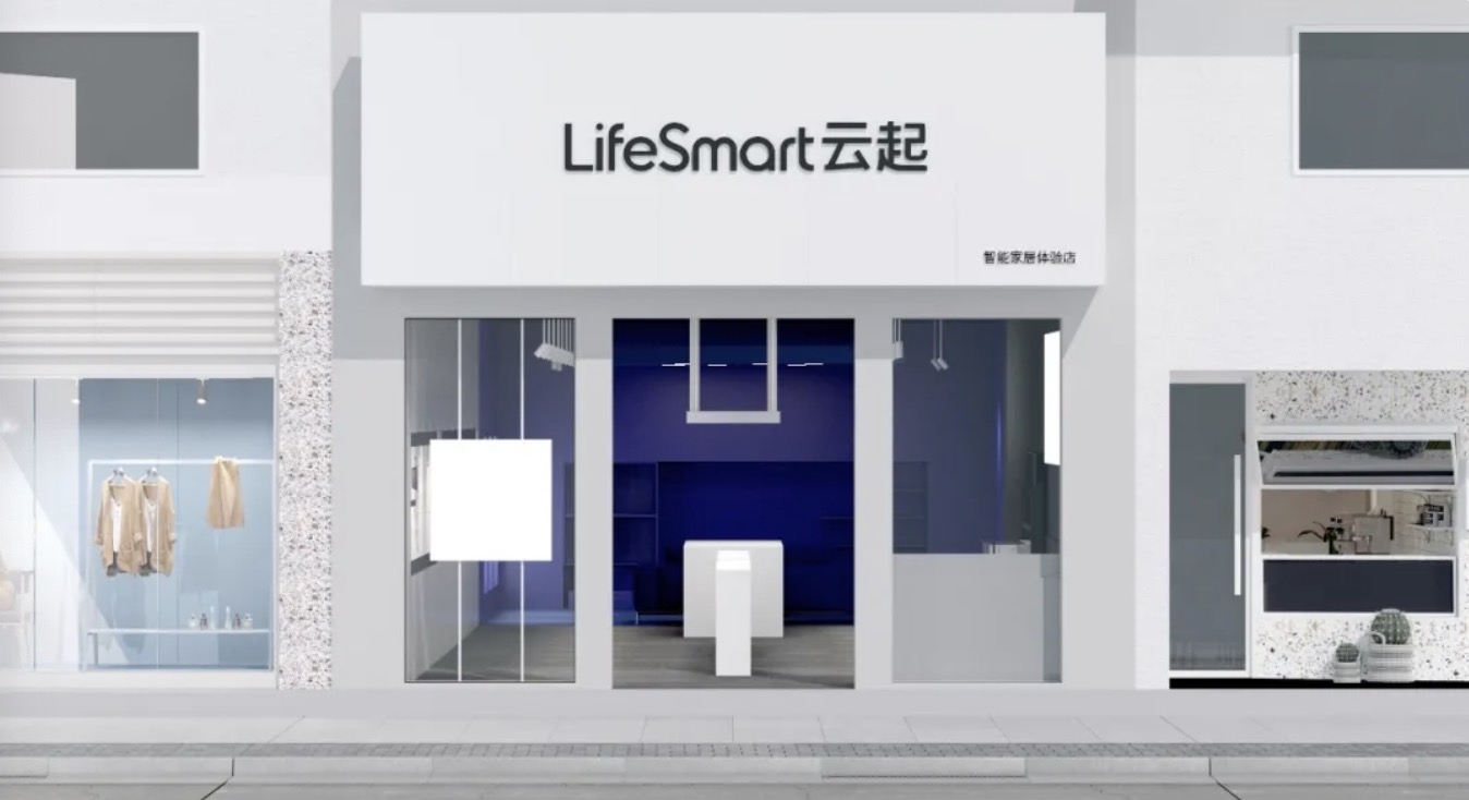
SI standardized door design
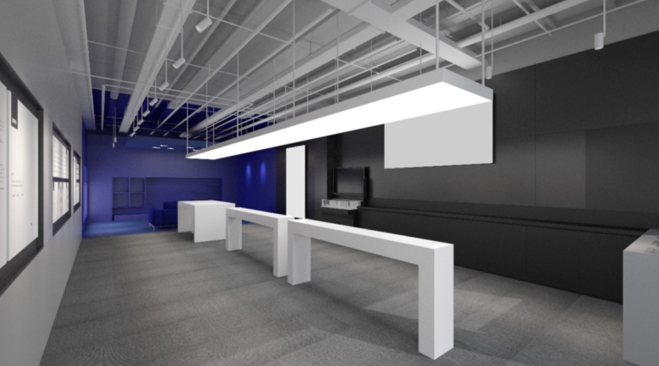
The standard exhibition table of LifeSmart 90 square concept store
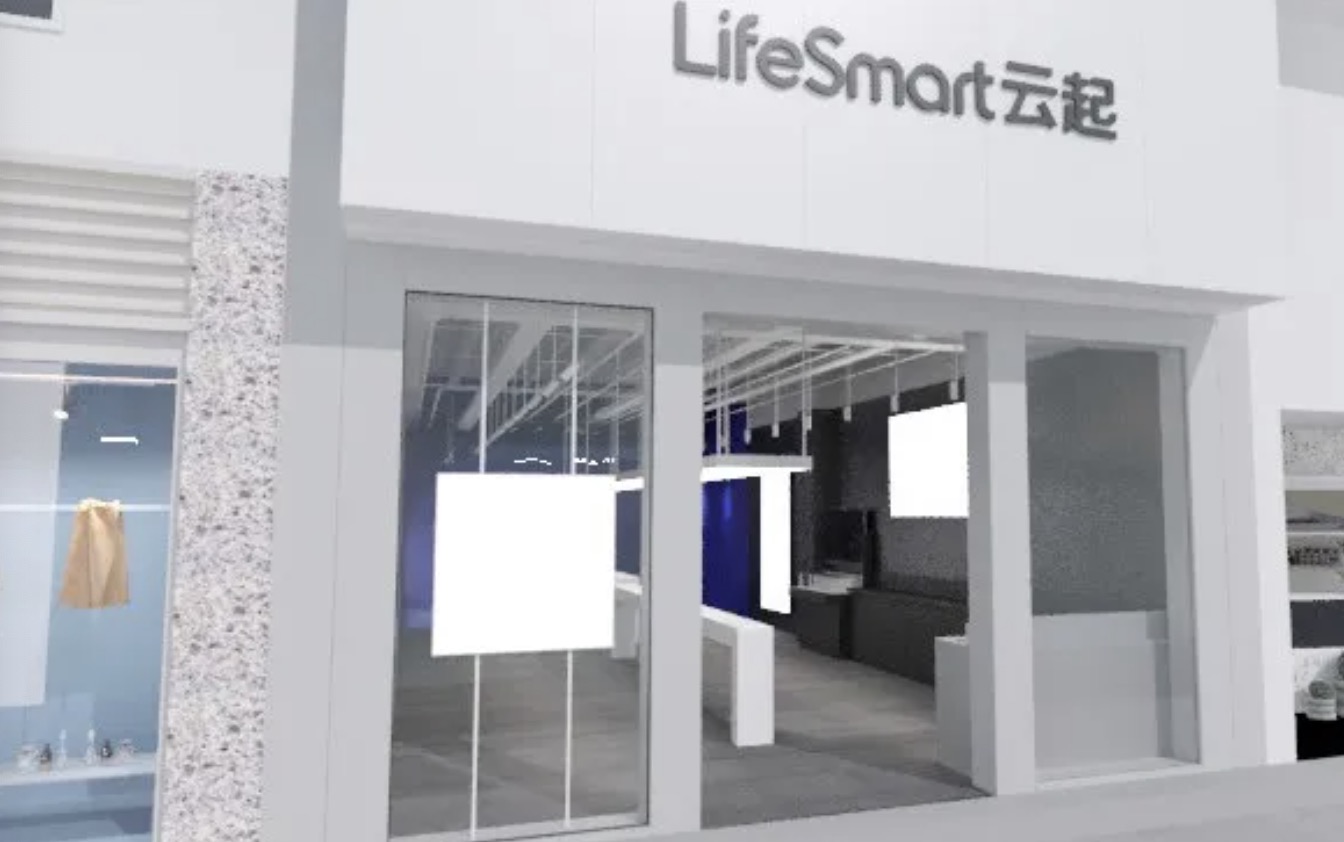
The white soft film lightbox is an important iconic visual symbol
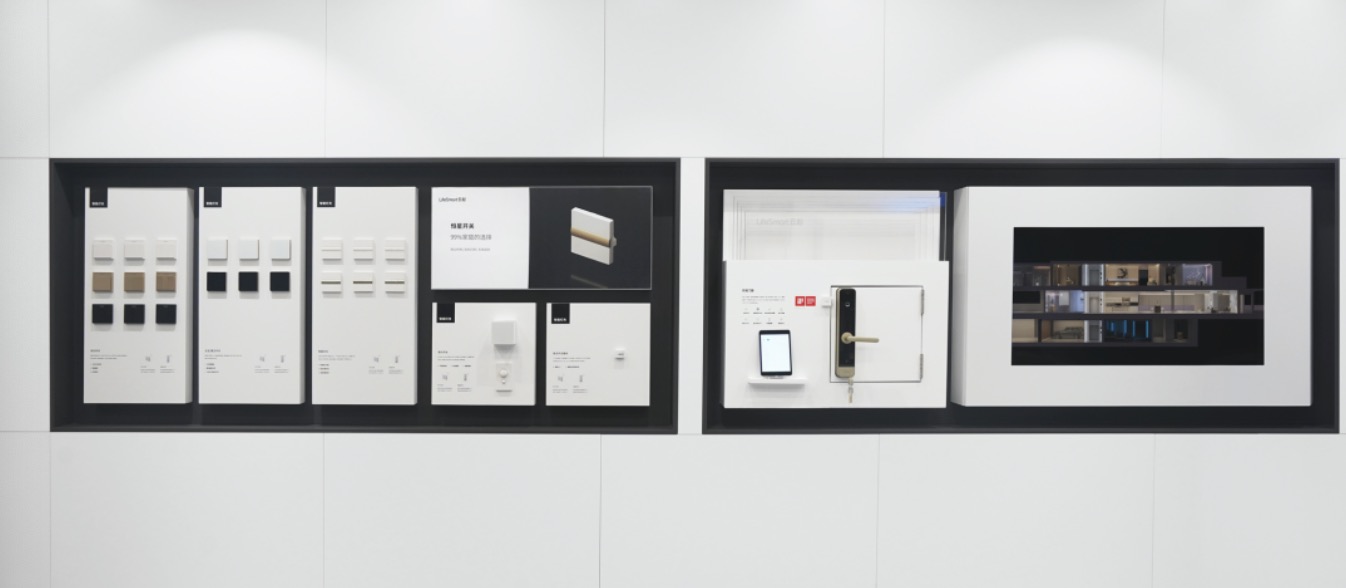
Recessed design exhibition wall
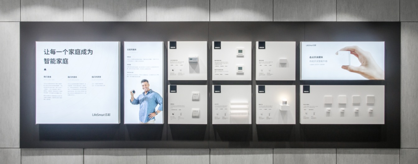
Protruded design exhibition wall
The experience area presented by LifeSmart is s staged display space. The audience area allows users to observe the changes on the stage by watching the performance, which is the demonstration of smart home. After the user enters the stage, it is easier to simulate the use scene of the smart home immersively.
(it's like a stage area and the smart home demonstrations open to all users. Walking into the stage, users are allowed to simulate all the scenes in a more immersive way)
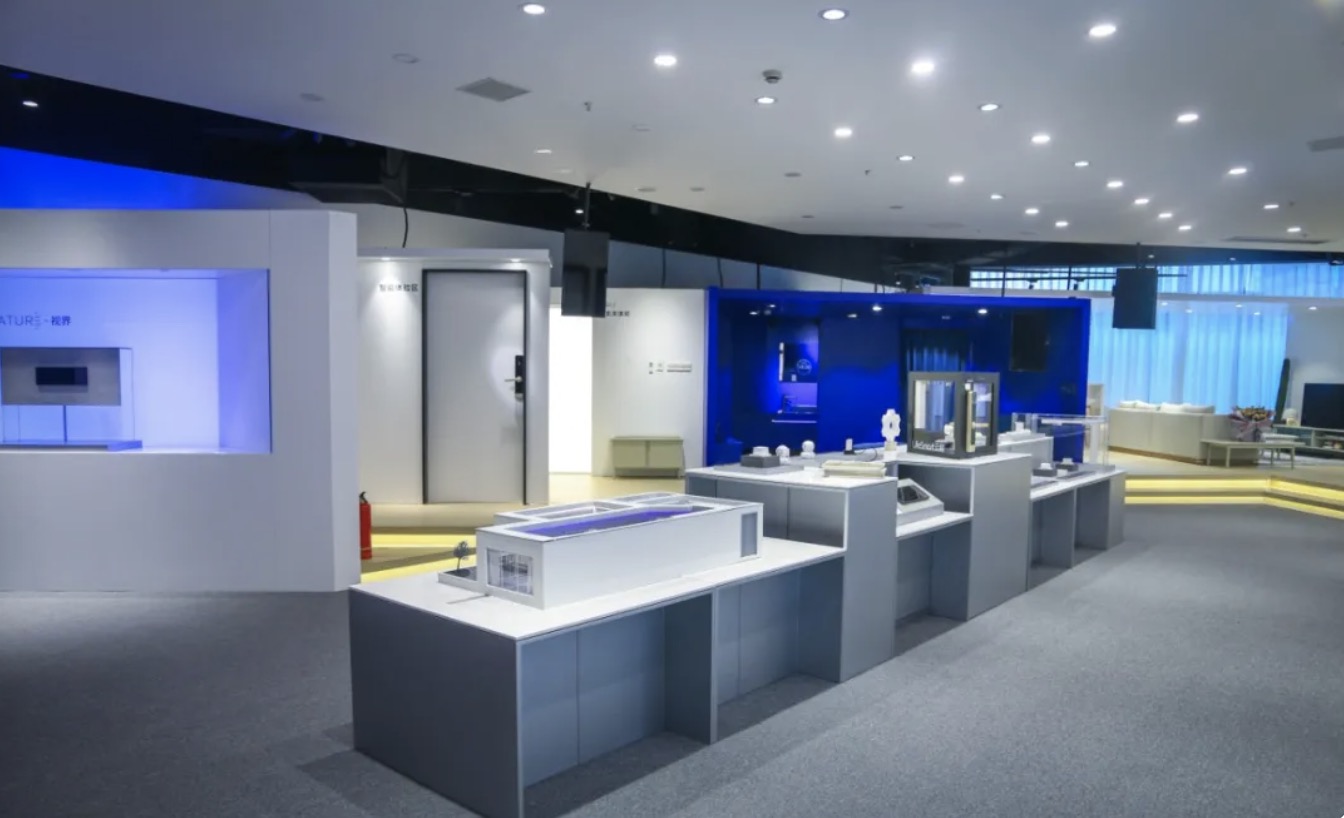
Staged display and open circulation
In the new SI, the Classic Blue, becomes the main theme of the entire experience space vision. In order to establish an experience zone with LIfeSmart brand character in a more general space, we set rules for the colors of the experience zone while products and luminous things are allowed to keep color of the own. This is the new design concept of LifeSmart experience are: The Classic Blue Box. Because only in this way, the more unified and purer the spatial design, can make the user's vision and impression be more influential. A more unified and consistent spatial design would maximize the first visual impression of our users.

Blue represents rational, precision, and a sense of technology
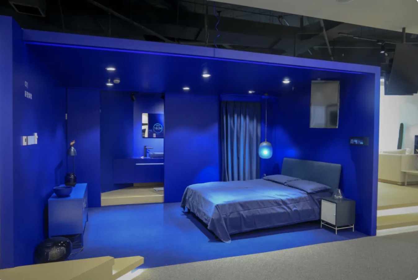
New visual identity: LifeSmart Blue Box
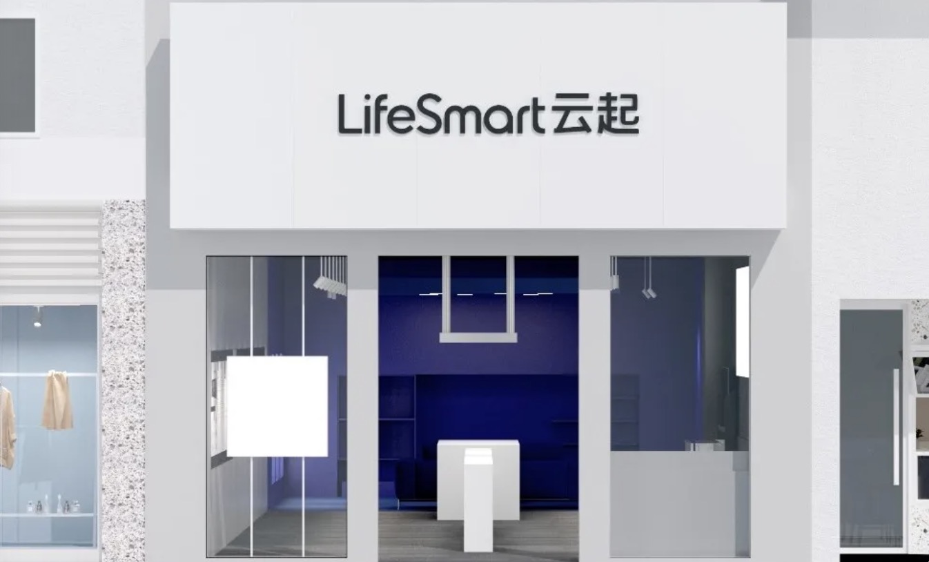
LifeSmart Blue will become the main theme of the entire experience space vision
Simplified display props, purer space design, more unique visual symbols consist of a more unified brand image, this is a subtraction formula of LifeSmart SI2020.
Become a business partner
| Sitemap |
get a quote